
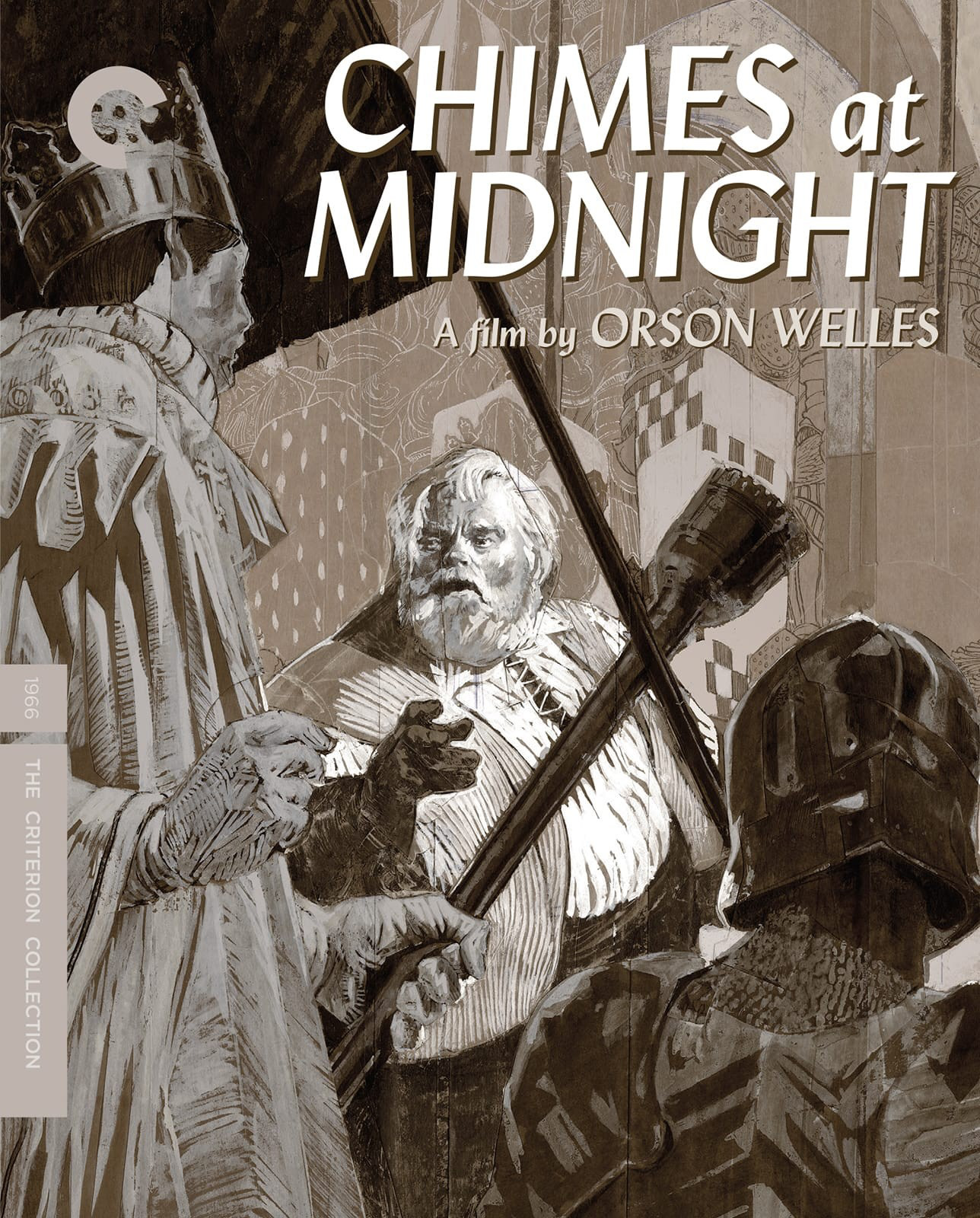
From the Criterion Collection: "The crowning achievement of Orson Welles’s extraordinary cinematic career, Chimes at Midnight was the culmination of the filmmaker’s lifelong obsession with Shakespeare’s ultimate rapscallion, Sir John Falstaff. Usually, a comic supporting figure, Falstaff—the loyal, often soused friend of King Henry IV’s wayward son Prince Hal—here becomes the focus: a robustly funny and ultimately tragic screen antihero played by Welles with looming, lumbering grace. Integrating elements from both Henry IV plays as well as Richard II, Henry V, and The Merry Wives of Windsor, Welles created a gritty and unorthodox Shakespeare film as a lament, he said, “for the death of Merrie England.” Poetic, philosophical, and visceral—with a kinetic centerpiece battle sequence that rivals anything in the director’s body of work—Chimes at Midnight is as monumental as the figure at its heart."

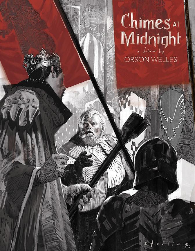
The original illustration commissioned by Criterion Collection is shown on the right. In revisiting the image, I sought to change several things:
1. I had drawn the king's face much more to my liking in one of the studies.
2. I wanted the flags to play a better role in framing the image.
3. I've been looking for a way to introduce limited spot colors into these collage pieces and I found something I rather liked in the gray and red.
4. I cheated a bit and made this into much more of a poster format. The original was used for both DVD and CD packaging for Criterion Collection.
The two images shown above allow for better placement of type and feature the crest on the flag that I had originally drawn on the underlayer shown below. I love what Eric did with the original type, but elected in the revision to integrate the type more directly into the flag.
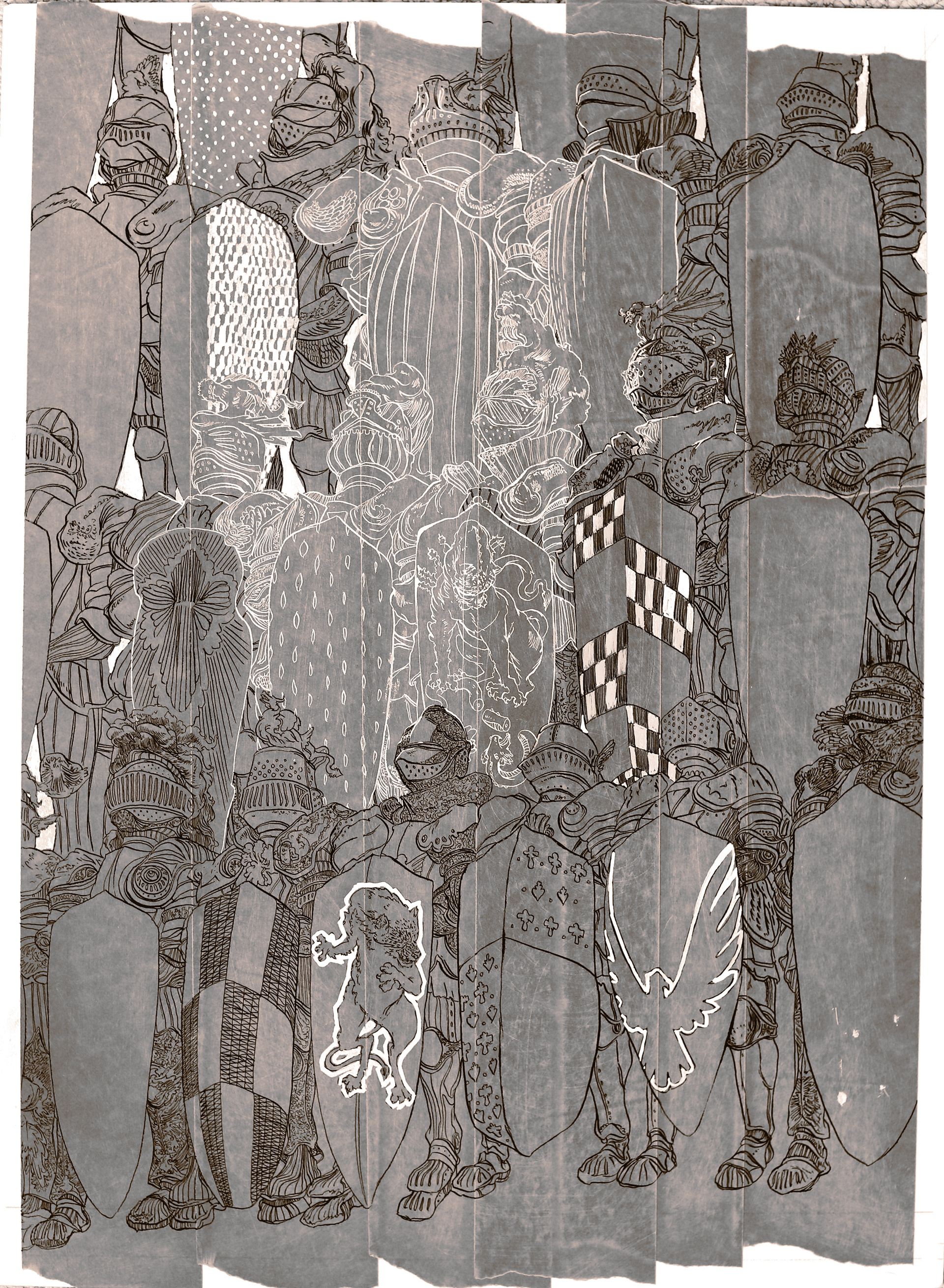
Elements from the image shown to the right can be seen in the background of the proceeding paintings, but the entirety of the drawing is lost beneath a number of additional layers.
Medium: Black and white ink on board. Digitally colored.